
Essential Vocabulary for IELTS Academic Writing Task 1 (Graphs & Charts)
When you write IELTS Academic Writing Task 1, describing a graph or chart, vocabulary matters: about 25% of your score comes from the range and accuracy of the words you use. Having good adjectives, adverbs, verbs, and phrases helps you write more clearly, accurately, and impressively.
🧠 1. Start With Strong Introduction Phrases
Instead of just writing “The graph shows…”, use higher-level phrases to paraphrase the prompt. For example:
✔️ The graph illustrates the trends in…
✔️ The graph reveals information about the changes in…
✔️ The graph provides the differences between…
✔️ The graph presents how X has changed over a period of…
🚫 Avoid generic phrases like “The graph above/below shows…” in your introduction
🆙 2. Useful Adverbs for Describing Trends
Adverbs help describe how things change (speed, amount, pattern). These are great for showing vocabulary range:
Approximately: Roughly; not exact
Dramatically: Big and fast change
Erratically: Uneven / irregular
Gradually: Slowly, step by step
Markedly: Noticeably
Significantly: Important change
Slightly: Small change
Slowly: Not quickly
Steadily: In a smooth, even way
🔁 3. More Dynamic Verbs and Nouns
Avoid repeating basic words like rise and fall. Use a variety instead:
Increase →
📈 Climb, increase, improve, jump, leap, surge, rocket, skyrocket, soar, shoot up, pick up, grow
Decrease →
📉 Collapse, decline, decrease, dip, drop, go down, plummet, plunge, freefall, slide, slip, slump
Fluctuation →
🔃 Be erratic, vary, rise and fall, be fitful
These alternatives help show range and precision in your vocabulary.
📅 4. Time Phrases to Describe Periods
Time expressions are key in Task 1 to describe when changes happen. Try using these:
✔️ Between… and… – Between 1982 and 1992 there was a steady drop.
✔️ From… to… – From 1992 to 1996 there was a dramatic increase.
✔️ In the year… – In the year 2020, unemployment spiked.
✔️ During/Over the period – During the 1980s, trends stayed consistent.
✔️ By… – By 1997, market growth had stabilized.
✔️ Over the past/previous… – Over the previous year, rates sharply increased.
These add precision and clarity to your descriptions.
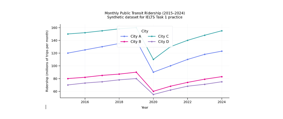
✍️IELTS Academic Writing Task 1 Prompt
The line graph illustrates monthly public transit ridership in four cities (A–D) from 2015 to 2024. Summarize the main features and make comparisons where relevant. Write at least 150 words.
✅ Band 8–9 Model Answer
The chart depicts trends in public transport usage across four cities between 2015 and 2024. Overall, ridership in all locations increased steadily until 2019, fell sharply in 2020, and then recovered gradually without fully regaining pre‑2020 peaks. City C remained the busiest throughout.
In 2015, Cities A and C started at roughly 120 and 150 million passenger trips per month, respectively, while B and D were lower at 80 and 70. By 2019, each city peaked, with City C reaching 160, ahead of A (140), B (90), and D (80). In 2020, ridership plunged to its trough—most notably in City C (down to 110) and City A (90), whereas B and D dipped to 60 and 55, respectively.
From 2021 onward, figures rebounded at a measured pace. By 2024, City C had almost recovered to 155, while City A climbed to 123. Cities B and D followed a similar pattern, ending at 83 and 75, respectively. Notably, the gap widened between the top two systems: the difference between Cities C and A increased from 20 in 2019 to 32 by 2024. In short, while usage stabilized and trended upward post‑2020, all four networks remained slightly below their earlier highs.
Final Tips
✅ Use varied vocabulary (don’t repeat “increase/fall” too much)
✅ Combine adverbs and strong verbs
✅ Include time phrases to show range
✅ Link ideas so your graph description flows
Practising these suggested phrases and words will help you improve your IELTS Writing Task 1 lexical resource score